Once these circles had been integrated the next challenge was in how to organise the circles on screen. I began investigating this by placing the circles randomly on stage as shown below:

However I felt this did not provide the viewer with much understanding of the information due to the random nature of this approach, and prevented the viewer from making any differentiation between each of the comments that are represented. I therefore then tried a more structured approach putting the visuals into lines, a new line representing a new post. This is shown below:
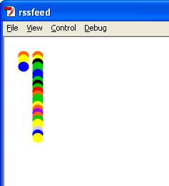

These were an improvement on the randomised version as they allowed the viewer to compare the different posts based on their colours and identify which parts of the visualisation apply to which parts of the audio. However I still felt that more could be gained from the visualisation and it could be better fitted within the context of the project. I therefore continued to experiment with the visuals until I discovered the version below:

I like this design as it displays the circles in a very music based way. The format particularly reminds me of guitar tab and how that is laid out, but it is also similar to a standard score. I therefore think this is a good design for the visualisation as it is like providing a notation of the text as well as an audio for the viewer of the project. This is why I chose to add the horizontal lines, both to better separate the individual circles and to create a stronger bond between the project and musical notation. To ensure this theme is followed through the lower notes are placed at the bottom of the visualisation and the higher notes higher up just like a standard score. Also to outline where the different comments start and finish both in the audio and visualisation a vertical line is added, again similar to a standard score, making a strong link between the project and its musical undertones. Being that the different notes are now separated by where they are placed vertically it is questionable as to whether to keep the colours as this is not standard to musical notation. However I have decided it is better to keep the colours in the visualisation for three reasons. Firstly by keeping the colours the viewer can identify a bigger difference between each of the rows and so can identify which notes apply to which colour more easily. As well as this it allows the viewer to better judge which notes are used more often, and so, which length of word is most common. Finally the colours also help the aesthetic of the visualisation and so for these reasons I have chosen to keep them within the project.
The only other element of this design that needs to be considered is the text element showing the posts that the audio and visual is referencing. I have considered including this as it can provide the viewer with something to compare the other elements with to give a better sense of what the project is achieving. However this will very quick get filled up with posts from people placing comments on the Facebook page and so it may be difficult to see and investigate the text in relation to the audio and visuals. This therefore needs to be looked at further before my project can be fully completed.
No comments:
Post a Comment